
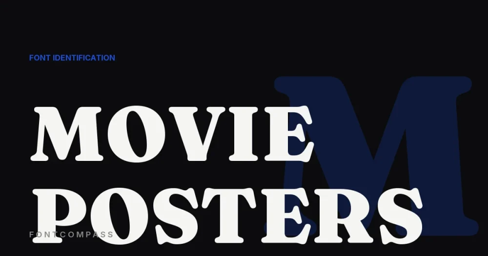
It’s a running joke in the film industry: if a movie poster needs a serious, epic-feeling title treatment and nobody can decide on a font, the answer is almost always the same typeface. It’s been used so often it has its own nickname among designers — “the Trajan Movie Poster.”
That font is Trajan, designed by Carol Twombly for Adobe in 1989, based directly on the capital letterforms carved into Trajan’s Column in Rome around 113 AD. It’s an all-capitals design — there’s no lowercase at all — which is part of why it reads as monumental and authoritative rather than casual.
Trajan’s association with film became so overwhelming through the 1990s and 2000s — Gladiator, Titanic, and a huge number of prestige dramas and historical epics all used it — that it eventually became a genre cliché in its own right, parodied for showing up on virtually any film trying to look important. It’s cooled off since its peak, but it’s still one of the most recognizable typographic signatures in movie marketing history.
Why It Works (and Why It Got Overused)
Carved Roman capitals carry thousands of years of built-in gravitas — the same visual authority stone inscriptions have always projected. For a studio marketing team needing a title treatment that reads as serious and prestigious with zero risk, Trajan was always the safe, defensible choice. That safety is exactly what made it so ubiquitous it eventually undercut itself.
Where to Buy It
This post contains an affiliate link — if you buy through it, we may earn a commission at no extra cost to you.
Trajan Pro by Adobe Originals is the official digital version, carrying the full weight of its film-poster history if you want that same monumental, authoritative effect.
Trajan isn’t the only typeface doing genre-signaling work — What Fonts Do Luxury Fashion Brands Use? covers the same idea for fashion.
Keep Reading
Two of the most-searched poster faces are not fonts at all: the Barbie logo and the Disney script are both bespoke lettering. If you are setting type for print rather than identifying it, our picks for professional book cover design and editorial and magazine design cover the licensing side too.
Frequently Asked Questions
Is Trajan free to use?
No — Trajan Pro is a commercial Adobe Originals typeface, sold through MyFonts and other marketplaces, not a free font.
Why doesn’t Trajan have lowercase letters?
It’s based directly on ancient Roman capital inscriptions, which only used capital letterforms — the original design intentionally has no lowercase.
Is Trajan still used on movie posters today?
Less than during its 1990s-2000s peak — its sheer ubiquity turned it into a cliché, and many designers now deliberately avoid it for that exact reason, though it still appears occasionally.

Leave a Reply