
NASA’s red “worm” logotype — retired in 1992, then quietly brought back for select missions since 2020 — is one of the most divisive rebrands in design history. It’s also frequently misidentified as a modified Helvetica. It isn’t. So, what font is the NASA worm logo? There isn’t one — it’s fully hand-drawn lettering, not a licensable typeface.

The worm is fully custom lettering, designed in 1975 by Richard Danne and Bruce Blackburn as part of the U.S. Federal Design Improvement Program, an initiative championed by the National Endowment for the Arts to modernize government agency branding. The letterforms use a single, consistent stroke weight, rounded terminals, and — most distinctively — the two “A”s are drawn without crossbars, which gives the wordmark its smooth, continuous, worm-like flow and its nickname.
It’s not based on any existing typeface. The confusion with Helvetica likely comes from the era — geometric, single-weight sans-serifs were everywhere in 1970s corporate identity — but the worm’s letterforms, especially those open “A”s, were drawn from scratch specifically for NASA.
Want That Same Technical, Space-Age Sans for Your Own Project?
This post contains an affiliate link — if you buy through it, we may earn a commission at no extra cost to you.
Eurostile (from $39/style) is the classic go-to geometric sans for that retro-futurist, space-age feel — the same square, technical energy that’s shown up in sci-fi and aerospace branding for decades, with a proper commercial license.
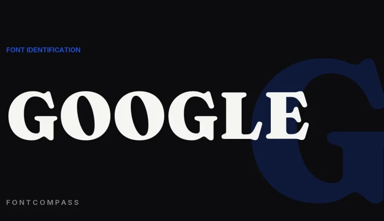
NASA isn’t the only case of a logo being mistaken for a font it isn’t — What Font Does Google Use? (Product Sans to Google Sans) covers a similar mix-up.
The Worm is the clearest case of a wordmark that is really custom lettering rather than a font — the same story as IKEA’s Futura years, told from the other side. For faces with that clean 1970s systems feel that you can license today, see logo design, editorial and magazine design, and app and SaaS branding.
Frequently Asked Questions
Is the NASA worm logo set in Helvetica?
No, despite the common assumption. It’s fully custom lettering designed from scratch by Richard Danne and Bruce Blackburn in 1975, not based on Helvetica or any other existing typeface.
Can I download the exact worm logo font?
No font file exists for it — it’s a bespoke logotype, and NASA’s logos are U.S. government works, but the specific lettering isn’t distributed as a usable typeface.
What font looks similar to the NASA worm logo?
Eurostile is the closest widely-licensed match for that geometric, technical, space-age look, though it isn’t an exact recreation of the custom worm letterforms.

Leave a Reply